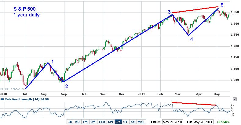
The chart below of the S&P 500 shows where I have drawn in 5 waves in blue and a divergence pattern between price and the Relative Strength index in red. This pattern is consistent with
Elliott Wave Theory which enjoys a rich history in market technical analysis. Indeed, I have posted this pattern before back on
August 11, 2010 which was the end of wave 1 in this cycle and lead to an approximate 2 week pullback to the bottom of wave 2/start of wave 3 at the beginning of September 2010. This illustrates the fractal nature of the markets where the first wave can be seen as composed of 5 smaller waves. Again, I posted back on
April 25, 2010 another example of this 5 wave patter and this time lead to a 9 week sell off in the market to the lows of July 2010. Because of the extended nature of the advance that we have enjoyed since March 2009 I am inclined to believe that we will again have a more severe sell off that is likely to last at least a few months. In fact, this could be the beginning of a fourth wave on the monthly time frame Elliott wave pattern. Other factors influencing my thinking here are the European debt crisis which is pushing the US Dollar higher, and consequently the stock market lower. And also the end of the Fed QE2 program scheduled to end at the end of June. Click on chart to enlarge.

The table below shows the nine S&P 500 index sectors sort by 4 Weeks % Change. I sorted by the 4 Weeks % Change to show which sectors have performed the best since the market high back on May 2, 2011. Since the time of the high in the market Utilities, Healthcare, and Consumer Staples have been the best performers. These are defensive sectors of the market that do best when the overall market is going down. This is consistent with the
Sector Rotation Model in which different economic sectors under or over-perform the market at different points in a business-cycle. Riskier sectors in the market are likely to do worse at a time like this. Click on table to enlarge.


![[Most Recent Quotes from www.kitco.com]](http://www.kitconet.com/charts/metals/base/copper-d.gif)
![[Most Recent Quotes from www.kitco.com]](http://www.kitconet.com/charts/metals/gold/t24_au_en_usoz_2.gif)
![[Most Recent Quotes from www.kitco.com]](http://www.kitconet.com/charts/metals/silver/t24_ag_en_usoz_2.gif)

No comments:
Post a Comment