Sunday, January 30, 2011

Market Summary

The chart below shows the wild swings the Ultra Crude Oil ETF UCO has gone through over the last few months and the large 8.9% move it made on Friday. The unrest in Egypt has led to a swing high in the price of oil and this ETF is double leveraged moving two times on a percentage basis as the price of oil. Clearly the trend is up and now price is above the 50 day moving average and looks to be headed higher. Click on chart to enlarge.

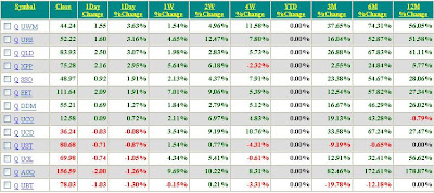
The table below of ETFs followed sorted by best performing ETF on a weekly basis shows AGQ the ultra silver ETF did the best on a one week percentage change basis up 3.01% but the real story is that it was up 7.70% on Friday as the market may have stopped its decline and begun a reversal to the upside. How this plays out we will just have to wait and see. Click on table to enlarge.

Tuesday, January 18, 2011

Market Summary

The chart below is of the double levered ProShares Financials Sector ETF with the ticker symbol UYG. This ETF has performed the best for the past week of the ETFs listed in the table below the chart. The financial sector was the laggard for several months relative to the other sectors but has been the strongest sector for the last week with UYG up 5.30% for the last week compared to 2.0% for the S&P500. Click on chart to enlarge.

For the YTD period QLD is up the most up 6.77% while the silver ETF AGQ is down the most -12.29%. For the week, UYG was up the most up 5.30% while the ProShares Ultra 20+ Year Treasury UBT was down the most -3.07%. Click on table to enlarge.

Sunday, January 9, 2011

Market Summary

The first chart below is of the QLD which is the double leveraged ETF that follows the QQQQ which is itself an ETF that follows the Nasdaq 100 Index. As can be seen the price action is very bullish. Note a hammer formation on Fridays candlestick and a similar hammer formation that occurred on September 28 followed by four red candlesticks which found support on the 20 day moving average (blue line). Click on chart to enlarge.

The table below lists the ETFs that I track showing QLD to be the leading ETF so far this year and for the week. Click on table to enlarge.

Monday, January 3, 2011

Market Summary

For the new year I will change the format slightly and post a chart of a top performing ETF from the list of ETFs in performance table below the chart. For the first day of this new year the ETF UWM was up the most up 3.63% breaking out of a bullish flag formation. This is a double leveraged ETF fund based on the Russell 2000small cap index which lead the market to the upside last year and is still showing signs that the rally is continuing into the new year. The blue line is the 20 day moving average and the red line is the 50 day moving average. A good place to buy in an up trend is between the two moving averages on a pull back. Click on chart to enlarge.

The table below lists the ETFs that I am tracking and is sorted by largest percent change for 1 day. Note the YTD column is reset to 0. Click on table to enlarge.