Monday, September 19, 2011

Market Summary

I was surprised after my last post that the market rallied instead of crashed as I thought it would. Last week however appears to have been a retracement rather than a rally as the market went up before it continues on its way down. The S&P 500 has been in a sideways channel for the past 6 weeks in what appears to be a 4th wave and a bear flag. While some markets did appear to put in a 5th wave bottom, for example, the financial sector index XLF on August 23rd, the S&P 500 did not put in a lower low than the 3rd wave and so did not technically put in a 5th wave bottom. While it is possible that the market could rally up from here it would have to be news or event driven to give the market a lift and I believe the higher likelihood is that the market will fail here and go lower. All eyes will be on Greece whose two-year notes rose for the first week in two months last week. The yield had climbed above 80 percent on September 14th but has currently come back to 54 percent. As the risk of default increases so does the costs to borrow money.

The current situation feels somewhat similar to the 2008 crash in the market following the Lehman Brothers bankruptcy. In keeping open to other points of view I read a very interesting article by Prof. Mark Blythe titled How to Turn a Continent into A Subprime CDO which I hope you find insightful.

The chart below shows the open after the weekend of the Euro / US Dollar showing how the Euro has fallen after retracing partially back up last week from its previous move down. The Euro appears to be headed towards the 1.30 area and could go much lower. When the Euro falls the US Dollar rises which puts downward pressure on the stock market. This week the Fed will hold a two-day meeting to discuss monetary policy and interest rates and lets hope they are able to help the market from falling off a cliff. Click on chart to enlarge.

Sunday, September 11, 2011

Market Summary

It now appears that a Greek default is imminent and that the banks that hold Greek debt/bonds will now have to write down that debt on their balance sheets. Greece has recently imposed a new property tax in addition to other austerity measures in order to qualify for the distribution of a second portion of a bailout package put together by the European Central Bank (ECB), the European Union (EU), and the International Monetary Fund (IMF). If Greece does not receive this second tranche of the bailout package it will be unable to pay its pensioners or interest on its debt which is currently 57% on a two-year note. From my reading German and French banks are most at risk however the contagion risk could spread to the global financial markets. Among the safe havens are gold and US Treasuries. As foreigners convert their currencies to US dollars in order to buy US Treasuries the dollar rises in value and that is what we are seeing. The chart below shows the Euro bank notes falling below the 1.40 level and to the lowest level in the past six to seven months and headed towards the 1.20 level. We see a series of lower highs and lower lows over the last three years which is bullish for the US dollar. As the Euro falls the US dollar rises which makes it more expensive for foreigners to buy US goods. This hurts exports and the stock market. The S&P 500 futures are currently at 1138 well below the 1150 support area and most likely headed to the next level of support at the 1100 area. Click on chart to enlarge.

Monday, September 5, 2011

Happy Labor Day

Continuing with the theme from my last post that markets make reversals in trend after 3-day weekends, the first chart below shows a 2-month daily chart of the S&P 500 that follows up with the first chart from my last post. The market did continue the rally after the 4th of July with two seeming doji-like days up to the 7th of July with a high of 1356.48 but sold off after that to the low on August 9th of 1101.54 and showed extreme volatility with a spike in the Volatility Index (VIX). With a brief bounce and pullback to form a double bottom the market appeared poised to rally and indeed there was both a higher low and higher high, the classic definition of an uptrend. In many markets there was put in a 5th wave bottom, or so it seemed, but not in the S&P 500 suggesting that the move off the August 9th low was a 4th wave and that the 5th wave has just begun with the August 31 high. Futures markets are poised to open significantly lower with initial support at the 1150 area and below that at the prior low near 1100. As to the theory that the market makes trend reversals after 3-day weekends, while it is true that the market did so on last Memorial Day weekend, the 4th of July did not fit the pattern exactly and as September 1st and 2nd were both down days it appears that the trend has already reversed to the downside and is not fitting the pattern either. Click on chart to enlarge.

Again as a follow up to my last post the second chart below is a 3-year monthly chart of the S&P 500 showing that we are in a 4th wave on the monthly chart. The 61.8% Fibonacci retracement level is at the 1150 area which should act as support. The problem is that if this level gets taken out with a close below this level then the whole wave count would come into question and we would no longer have a classic Elliott wave pattern. I think this level will hold and that the Fed will step in to support the market at their next meeting with some kind of further quantitative easing. The real problem is the European banks and sovereign debt. Greek two year bonds are yielding over 50% as can be seen here indicating a high likelihood of default. Compare that to the German bond yields here. Also, bonds of both Spain and Italy soared to record highs last week. Banks that hold these bonds could fall like dominoes taking one another down. The good news is that inter-bank lending as measured by the Libor has not spiked to the high levels seen after the Lehman Brothers collapse in 2008. The risk of recession has significantly risen with the last Employment Report showing no net jobs created in the month of August. Lets hope the markets don't continue with a downward spiral as shown by the left side of the chart below. Click on chart to enlarge.

Monday, July 4, 2011

Happy 4th of July

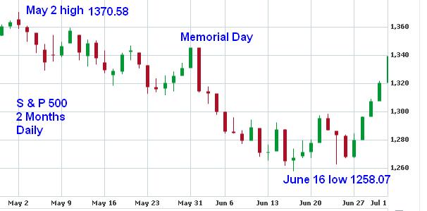
There is a pattern in which the market makes a rally into a 3-day weekend and then reverses on Tuesday as happened last Memorial Day weekend when the market rallied up to May 30 and then reversed June 1 continuing the down trend that began with the May 2 high of 1370.58. So far the low 1258.07 on June 16 has held for more than 2 weeks and the question is with price at 1339.67 will we make new highs to take out the May 2 high or have another long weekend reversal to take out former lows? The chart below of the S & P 500 two month daily shows recent market action. Click on chart to enlarge.

On a longer time frame the monthly chart below shows that if the June 16 low holds that we will have made a 4th wave bottom on the monthly chart. Note how the last two red candles on the monthly for May and June both formed Hammer Candlesticks which is very bullish and that should the market take out the high of last month June at the 1365 area it should be off to the races as the market rallies higher. Click on chart to enlarge.

Sunday, May 22, 2011

Market Summary

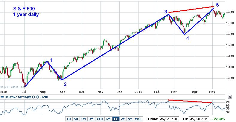
The chart below of the S&P 500 shows where I have drawn in 5 waves in blue and a divergence pattern between price and the Relative Strength index in red. This pattern is consistent with Elliott Wave Theory which enjoys a rich history in market technical analysis. Indeed, I have posted this pattern before back on August 11, 2010 which was the end of wave 1 in this cycle and lead to an approximate 2 week pullback to the bottom of wave 2/start of wave 3 at the beginning of September 2010. This illustrates the fractal nature of the markets where the first wave can be seen as composed of 5 smaller waves. Again, I posted back on April 25, 2010 another example of this 5 wave patter and this time lead to a 9 week sell off in the market to the lows of July 2010. Because of the extended nature of the advance that we have enjoyed since March 2009 I am inclined to believe that we will again have a more severe sell off that is likely to last at least a few months. In fact, this could be the beginning of a fourth wave on the monthly time frame Elliott wave pattern. Other factors influencing my thinking here are the European debt crisis which is pushing the US Dollar higher, and consequently the stock market lower. And also the end of the Fed QE2 program scheduled to end at the end of June. Click on chart to enlarge.

The table below shows the nine S&P 500 index sectors sort by 4 Weeks % Change. I sorted by the 4 Weeks % Change to show which sectors have performed the best since the market high back on May 2, 2011. Since the time of the high in the market Utilities, Healthcare, and Consumer Staples have been the best performers. These are defensive sectors of the market that do best when the overall market is going down. This is consistent with the Sector Rotation Model in which different economic sectors under or over-perform the market at different points in a business-cycle. Riskier sectors in the market are likely to do worse at a time like this. Click on table to enlarge.

Sunday, April 24, 2011

Market Summary

The chart below is a 6 month daily chart of the S&P 500 showing an approximate 13% rise from low to high while it is up approximately 6% for the Year-to-Date period. What is noticeable about the chart is what is known as an inverted Head-and-Shoulders formation from about the middle of February up to the present. A Head-and-Shoulders formation is a chart pattern with three peaks, the middle peak being the highest, and the other two peaks forming the right and left shoulders. It is a topping pattern. However, an inverted Head-and-Shoulders formation is the opposite as it is an upside down Head-and-Shoulders formation and is a potential predictor of a move to the upside. In this case it predicts an upside move of approximately 100 points or to 1440. Will that happen? We will just have to wait and see. Click on chart to enlarge.

As a follow up to my previous post on the performance of the nine S&P 500 sectors the table below shows the sectors sorted by Volume % Change and what is of note is that the Technology sector shows an increase in volume while the other sectors and particularly energy show a marked decrease in volume. Energy has had a great run but now appears to be selling off in terms of volume inflows. Libya in particular is responsible for rising oil prices and I would not be surprised if the seeming stand off comes to a close soon with the fall of Gaddafi. That would surely bring the price of crude down. Click on table to enlarge.

A further comparison of Energy and Technology sectors shows that Energy is off of its high and that Technology has outperformed Energy in both the 2 week and 4 week time frames. Money rotates from the different sectors and while Energy is and has been the leading market sector on a shorter time frame it may lag allowing other sectors like Technology a chance to play catch up. Click on table to enlarge.

Sunday, April 3, 2011

Market Summary

With the end of the 1st quarter behind us I thought it would be a good idea to look at how the different sectors of the economy are doing. In trading and investing, if you pick the right sector to invest in even if you make a bad individual stock pick chances are you will be a winner and can say along with Charlie Sheen "winning". The old saying "a rising tide lifts all boats" can be applied to sector analysis. The S+P 500 is divided into nine sectors that can be followed with the following ticker symbols: XLB, XLE, XLF, XLI, XLK, XLP, XLU, XLV, and XLY. With this in mind I want to identify and take a look at the strongest and weakest sectors and the winner of the strongest sector award goes to XLE, the energy sector. As can be seen from the chart below it has been rising on a steady uptrend with prices well above their 50 day moving average which has acted as support. Click on chart to enlarge.

The winner of the weakest sector award goes to XLF, the financial sector. As can be seen from its chart below it has had choppy moves going back and forth as it has been rising and is currently right on its 50 day moving average at 16.53. As no continued rally in the economy can take place without support from the financial sector the question arises: Is the XLF the "Canary in the coal mine?" or is it simply lagging the broader economy? This is a difficult question to answer and time will tell so we will just have to wait and see. Click on chart to enlarge.

The table below list the performance of each of the nine sectors sorted by Year-To-Date(YTD). As can be seen at the end of the 1st quarter XLE is up nearly 16% while the XLF is up less than 1%. This is the kind of difference that makes all the difference in your trading and investing. For comparison, the S+P 500 is up 6.45% YTD. I hope this helps. Click on table to enlarge.