Monday, May 10, 2010

Market Summary

Market sentiment has turned distinctly bearish in all time frames as the market found support at the 61.8% retracement (red line on daily chart) of the entire move from the February lows to the recent highs. Look for a bounce up from here but just how high the markets can go is questionable. I will be watching the markets carefully for the development of a new wave count. Click on chart to enlarge.

Compare the prior table posted on May 1 with the one below. It is amazing how the numbers can change so radically and so fast. The small cap index, which on May 1 was top of the list and up nearly 12% for the year has today, 6 market days later, dropped to just over 2% positive for the year. But what is really amazing is that the dollar is up the most and now tops the list followed by gold via the GLD which is number two for the year. For the week most markets took a hit while the dollar and gold did well. Click on table to enlarge.

Wednesday, May 5, 2010

Sell in May and go away?

That is a familiar jingle of Wall St. and Main St. and all have heard it. But is it true this time? We got a sell signal yesterday as can be seen on the daily SPY chart below where the background color on the chart turned pink. There is some support at the 116 level where we got down to at the lows today and below that at the big gap that occurred in early March around 114. Fibonacci Retracement lines have been drawn against the latest up wave. A 10% correction would take us to about 110 and anything below that we will have to evaluate at that time and so we will just have to wait and see. Click on chart to enlarge.

Saturday, May 1, 2010

Market Summary

Another hard sell off and market sentiment has again turned bearish on the short and intermediate term. A topping pattern is occurring where the bulls and bears are fighting it out and reducing upward momentum. GS lost 9% just on Friday alone putting downward pressure on the financial sector. While the first few days of May may bring in buying pressure how long that lasts and where the market heads we will just have to wait and see. Note the bullish and bearish Harami pattern on the 240 min chart. Click on image to enlarge.

For the YTD period the small cap index is up the most up 11.95% and the UNG remains down the most. For the week GLD did the best up 1.92% followed by UGA and USO while UNG was off the most down -9.50%. Click on table to enlarge.

Thursday, April 29, 2010

Another wave to the upside

My target for the SPY is in the area of 123.30 which is the 61.8% retracement of the entire move down from the high in October 2007 to the low in March 2009. That is approximately 2% higher from where we are now and certainly is a possibility this week. We still have a weekly 5th wave pattern. Sentiment has again turned bullish and a break above 122 would be very bullish. Click on image to enlarge.

Tuesday, April 27, 2010

For the "IF" in life

As can be seen in the image below the there was a corrective sell off today that began with a gap to the downside and did not stop but kept on going down. Several areas of support were broken and the sell off was hard enough to change the sentiment of both the short and intermediate term sentiment to bearish as seen by the background color of pink on the 60 min, 240 min, and Daily charts. As mentioned in my previous post we had got to a weekly 5th wave high in the charts and the outlook is for a corrective move of either A) consolidation, or B) a trend reversal. We are not alone in the world and global conditions can influence our markets. Click on image to enlarge.

Applying the same methodology for trend analysis as I have done in the SPY image above I applied it to the FXI below which I use as a proxy for China. As can be seen by the background color of pink in the 60 min, 240 min, Daily, and Weekly charts China is bearish in all time frames and that is a bad sign. This chart was actually leading to the downside by about a week before the SPY began its move to the downside. Click on image to enlarge.

Sunday, April 25, 2010

Weekly 5th Wave Pattern

A weekly 5th wave pattern is noted on the SPY as drawn on the chart below. Does this mean the market has reached a top? Elliott Wave theory teaches that the market moves in 5 waves of 3 steps forward and 2 steps back and this is what we see here. While the market continues to show strength a reversal here could mean we could expect either A) an A-B-C correction pattern which is a sign of consolidation for further expansion and the start of a new wave count to the upside or B) a new wave count reversal to the downside. While these are only two of the possible ways the market could move they are the patterns that I will be looking for "IF" there is a corrective sell off to the downside. We live in a global economy and while the US economy shows signs of growth and expansion what happens in other parts of the world can affect us as well and we should expect this type of wave pattern to continue as it has in the past. However good Elliott Wave theory may be at describing predictive models of the market we still let the market make the decision as to the timing of reversal patterns. Market sentiment remains bullish. Click on the chart to enlarge.

Saturday, April 24, 2010

Market Summary

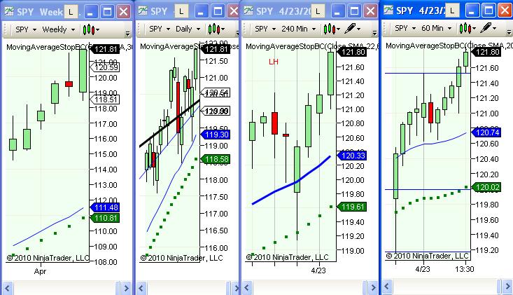
The rally continues once again another strong week to the upside. Market sentiment remains bullish in all time frames as noted by the green background color on the image below. Click on image to enlarge.
For the YTD period the small cap index $RUT remains the leader to the upside up 15.91% and for the week was on fire up 3.82%. Although UNG is the biggest loser for the YTD period it had a very strong week up 5.57%. EFA and FXI were flat for the week. Click on table to enlarge.