The Market Volatility Index, known as the VIX, measures the volatility of the market. A recent news story described it as "the options market's gauge of investor fear." Traders use VIX as a general inverse indicator of market volatility and sentiment. High numbers mean that there's excess bearishness, and low numbers indicate excess bullishness. The VIX is updated intraday by the Chicago Board Options Exchange (CBOE), using Standard & Poors 500 Index (SPX) bid/ask quotes. The chart below of the VIX shows three notable spikes. The first spike at the end of January is associated with the revolution in Egypt, the second spike with the outbreak of fighting in Libia, and the third spike with the March 11th earthquake in Japan. Click on charts to enlarge.
The second chart below is of the S+P 500. Note how the high in the market corresponds to the second spike in the VIX and how the low in the market corresponds to the third spike. The VIX has declined since its March 16th high and the S+P 500 made its bottom on March 15, the Ides of March, and has risen since then just as the VIX has fallen.
The chart below is of the ERX, the energy bull ETF. Note how bullish this chart looks as it approaches a double top and potential breakout to the upside. If, however, oil prices decline so will this ETF. My feeling is that over the next few days oil prices will decline as the US Dollar strengthens. However, in this volatile world anything is possible.
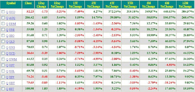
The table below shows the ETFs that are followed. AGQ, the Silver ETF, is up the most for the YTD period up 40.67% and up a whopping 12.23% for the week. The second place goes to DDM, ProShares Ultra Dow 30. Click on table to enlarge.
Sunday, March 27, 2011
Monday, March 21, 2011
Market Summary
The market is set to open higher per the futures market with the major indices all pointing higher. With the outbreak of fighting in Libya oil is currently just under $103 per barrel. This will bring up with it the other commodities as well. The US Dollar Index is currently 75.5 which is down from 76.75 a week ago. As a way to follow the markets I post here charts that I can make reference back to at a latter date. For example, last week I posted the EWV chart which goes up when the MSCI Japan Index goes down. Last week it was 34.70 and it is currently 36.10 though it had been as high as 45.34. Today I want to post the United States Oil chart USO to follow oil prices and the Financial Sector index XLF to follow the financials. Click on charts to enlarge.
As can be seen from the chart above USO has been in an uptrend and is expected to break out to new highs. It has support at the 50 day moving average (Red Line).
The XLF chart above shows a breakaway gap at last Friday's open where it broke above the closing price on Thursday. This should act as support and it is set to open higher.
The performance table above shows AGQ to be the top performer on the YTD basis up 25.34%. For last week the top two performers were UBT and UST, both bond funds, as investors sought the safety of bonds in the volatile market. These, however, are likely to decline next week as investors risk appetite increases.
Monday, March 14, 2011
Market Summary
My thoughts and prayers go to the people of Japan. After an earthquake and tsunami of epic proportions laid waste to cities along Japan's northeast coast the effects on the economy of Japan will no doubt play out for a long time to come. While the recovery will take time how the market reacts to this disaster will be followed closely. The chart below is of the ProShares UltraShort MSCI Japan and as can be seen this ETF, which goes up 200% the inverse(opposite) of the daily performance of the MSCI Japan Index, had been falling for many months until just a few days before the earthquake hit. It will be interesting to watch how high this goes. Click on chart to enlarge.
The table below shows the performance of a select list of ETFs sorted by performance on a Year-To-Date basis. While the table lists UCO, the Ultra Oil ETF, as up 315% I believe that is due to a split in the price and not a true reflection of its performance. Still oil is up significantly. The second listed ETF AGQ is the Ultra Silver ETF up 50% YTD. For the week UBT, the ProShares Ultra 20+ year Treasury bond ETF, was up the most followed by AGQ. Click on table to enlarge.
Subscribe to:
Posts (Atom)